How to create a high-converting SaaS homepage that instantly resonates with your ideal customer profile (+ Figma Template + Examples 2024)
🎁 Free SaaS Homepage Figma template + top SaaS homepages examples
Hey - it’s Alex - this time together with Tarik!
Today we cover:
1️⃣ B2B SaaS Homepage Conversion Blueprint
2️⃣ B2B SaaS Homepage Figma Template
3️⃣ Real-word SaaS Homepage examples
In case you missed the last 3 episodes:
✅ Ultimate LinkedIn ads guide for early-stage SaaS companies
✅ The best Outbound GTM Tech Stack
✅ Turn your SaaS messaging into powerful marketing/sales assets
If you’re new to the newsletter: I share with you bi-weekly 3 actionable growth tactics that will help you quickly grow your SaaS business from €0 to €1 million ARR 🚀.
A quick word from our sponsors
📢 SaaS growth tactics - Get access to 100+ actionable SaaS growth tactics 🚀
Unlock the growth potential of your SaaS product with a list of 100+ proven and actionable growth tactics for early-stage B2B SaaS startups to grow from 0€ to 3€ million ARR - helped 200+ SaaS leaders.
📢 Trackdesk - Your free affiliate marketing software for SaaS companies
1,000+ companies grow their affiliate revenue with trackdesk. 0€ initial investment. Recurring commissions, fully automated affiliate payouts, real-time performance reports, seamless Stripe integration, and access to the only Partnership Managers Marketplace in the world.
Want to reach 4500+ early-stage SaaS founders/leaders? Sponsor the next newsletter.
The B2B SaaS Homepage Conversion Blueprint
We're about to dive deep into the nitty-gritty of turning your B2B SaaS homepage from a conversion graveyard into a homepage that generates demos booked (for sales-led) and trial signups (for PLG).
In this no-BS blueprint, you'll discover…
✅ The exact 8-step process to double, triple, or even quadruple your B2B SaaS homepage conversions
✅ How to craft a Minimum Viable Positioning that clearly defines your market and product
✅ The secret to creating Value Propositions that resonate with your target audience
✅ A step-by-step guide to structuring your homepage for maximum impact
✅ How to transform your messaging into compelling homepage copy for each section
✅ Why most "best practices" are BS and what to do instead
🎁 Free Figma homepage template
This method will work for you even if …
Your product is more complex than quantum physics
You've tried every "conversion optimization" trick in the book and failed
Your current homepage looks like it was designed by a committee of drunk monkeys
You think your product is "too complicated" to explain simply
The importance of your SaaS homepage
Your homepage is the number one customer-facing messaging asset.
It's often the first point of contact between your potential customers and your product. A well-crafted homepage can be the difference between a visitor bouncing and a visitor starting their buyer journey (e.g., signing up for a free trial or booking a demo).
Your homepage should primarily speak to your potential customers (your Ideal Customer Profile or ICP) - not to your employees, investors, media, or other stakeholders. Its primary goal is to convert visitors to the next stage of your sales journey.
A good homepage should answer these 6 key questions for your visitors:
What is the product/service they offer?
What problem does it solve for me?
What can I do with the product?
Who is it for? Is this product for me?
What are the main benefits for me?
Can I trust the company?
Now, let's dive into the 8-step process to help you create a homepage that answers these questions and converts visitors into leads and customers.
The 8-Step Proven Process to Transform Your Homepage
Before you build your new SaaS homepage, invest time to have strong fundamentals (aka. product marketing). Use our templates for that:
👉 The Ultimate Framework to build your Ideal Customer Profile for SaaS startups
👉 The Ultimate SaaS Messaging Framework for early-stage Startups
Step 1: Define The Market (from the Ultimate SaaS Messaging Framework)
This step involves setting the market and minimum viable positioning and identifying the high-level problem your product solves.
Identify market insights or specific changes
Determine the high-level problem and its negative consequences
Example (sipgate trunking):
Market insight: The rise of remote work and multi-location teams is increasing the need for flexible, scalable communication solutions
High-level problem: Existing phone systems are often rigid, costly, and difficult to manage across multiple locations
Step 2: Identify Your Ideal Customer Profile
This step is crucial for understanding who's most affected by the problem you're solving.
Define who's facing the problem
Your homepage should always speak to your champion. Based on your GTM strategy (top-down or bottom-up) this can be either the end user or the decision maker.
Example (sipgate trunking):
Primary ICP: IT Admins & Teams in fast-growing SMBs, especially those with high volumes of outgoing calls
They're trying to optimize their telephone costs and find a scalable and flexible solution
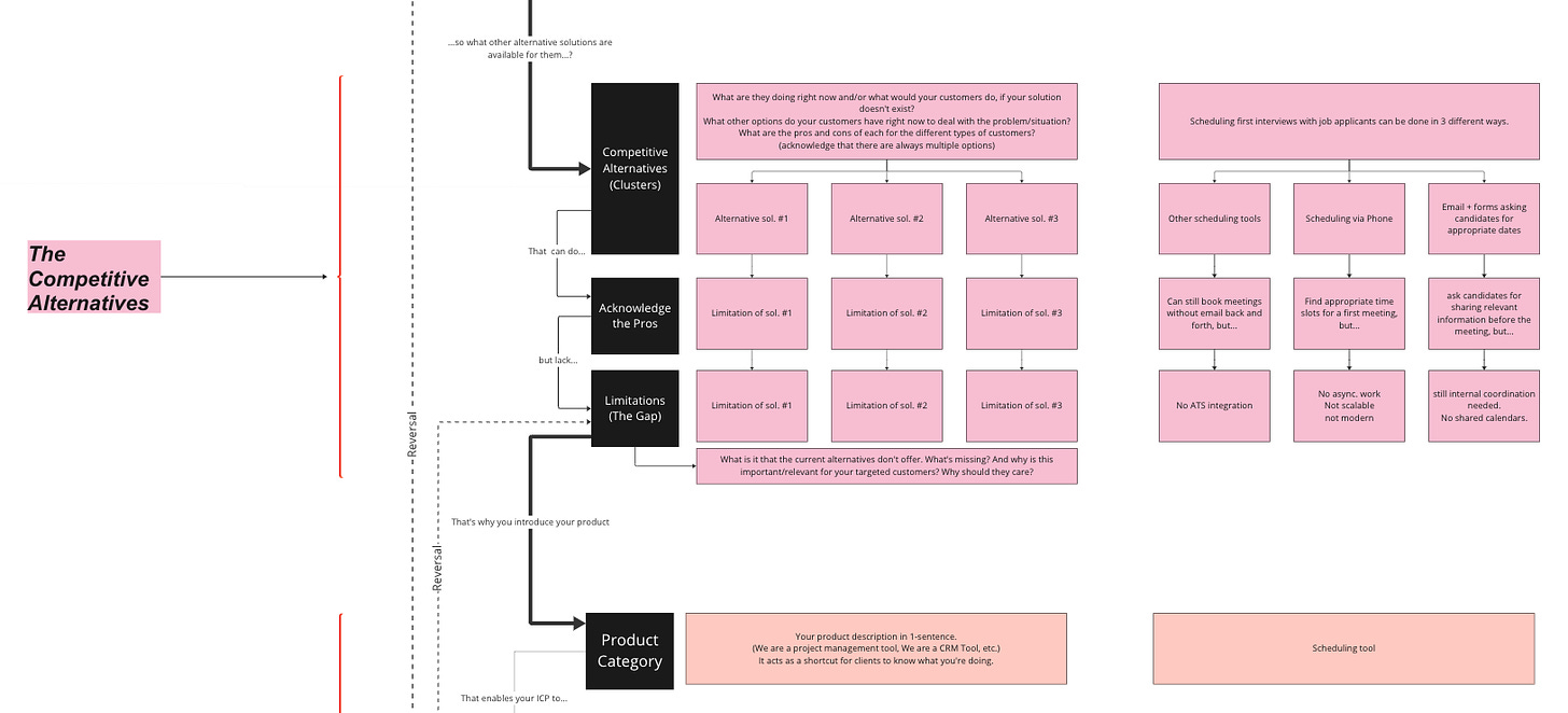
Step 3: Analyze Competitive Alternatives
Understand what customers are currently doing to solve their problems (status quo).
List different alternatives
Build clusters of alternatives
Add limitations for each cluster
Example (sipgate trunking):
Current Solution: Using separate phone systems at different locations
Limitations: Fragmented communication, high administrative effort
Step 4: Define Your Product
This is where you finally talk about your solution.
Define your product category
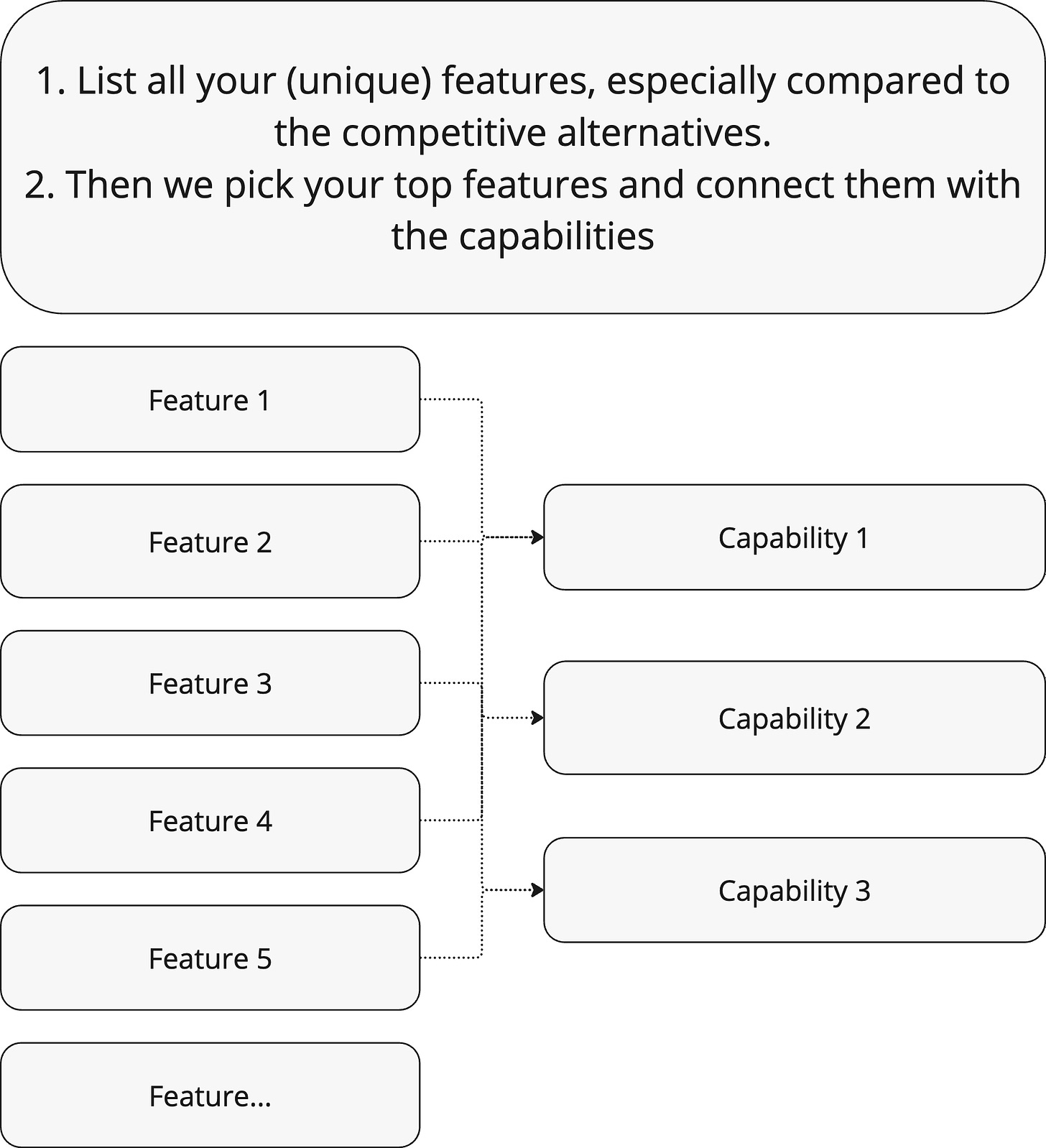
Identify key capabilities (what customers can do with your product that they can't without it)
List the top features that enable these capabilities
Example (sipgate trunking):
Product Category: SIP Trunking Solution
Key Capability: Scale your phone system easily on demand
Top Feature: Seamless integration into existing VoIP systems
Step 5: Craft Your Value Propositions
Connect all elements to create compelling value propositions.
Identify the results (what your product is increasing or decreasing)
Distinguish between functional, social, and emotional benefits
Add social proof and objection-handling elements
Each value proposition consists of:
Use Case: Identify the primary job your customer is trying to do.
Current Way: How are they currently solving this problem?
Problem: What's wrong with the current solution?
Capability: What can your product do to solve this?
Feature: What specific feature enables this capability?
Benefit: What's the result for the customer?
Example: Let's say you're Calendly (scheduling software):
Use Case: Scheduling meetings with clients
Current Way: Back-and-forth emails to find a suitable time
Problem: Time-consuming, inefficient, prone to double-booking
Capability: Automate scheduling process
Feature: Shareable booking link with real-time availability
Benefit: Save time and eliminate scheduling headaches
Step 6: Transforming Messaging into Homepage Copy
Now we'll structure our homepage according to "The B2B SaaS Performance Design Homepage Framework" template, using your messaging to create compelling copy for each section.
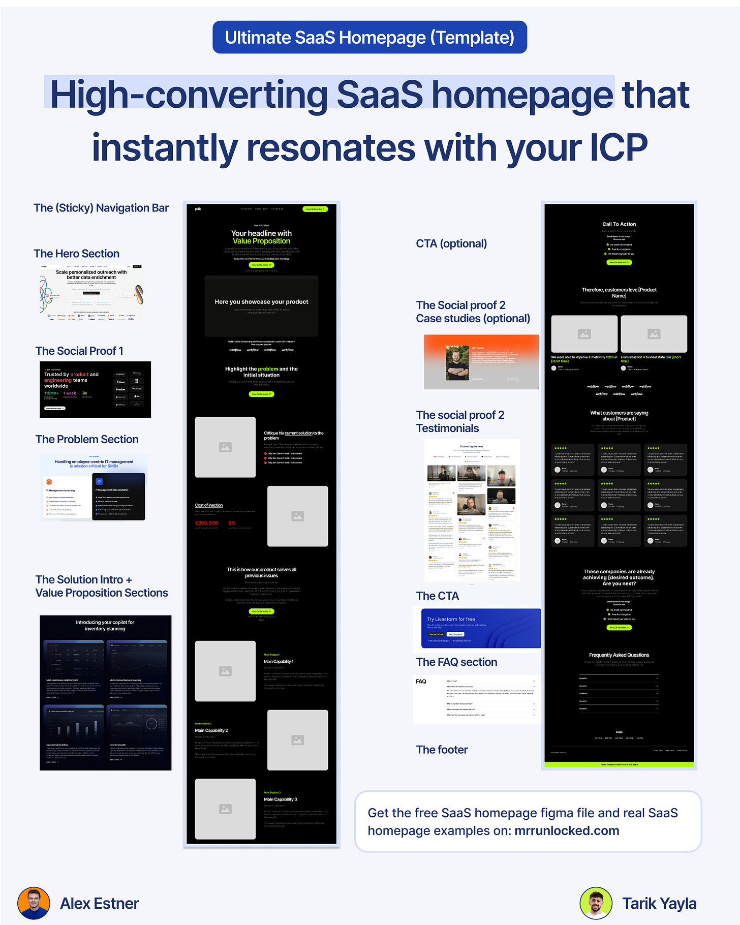
The perfect SaaS Homepage comes with 10 sections:
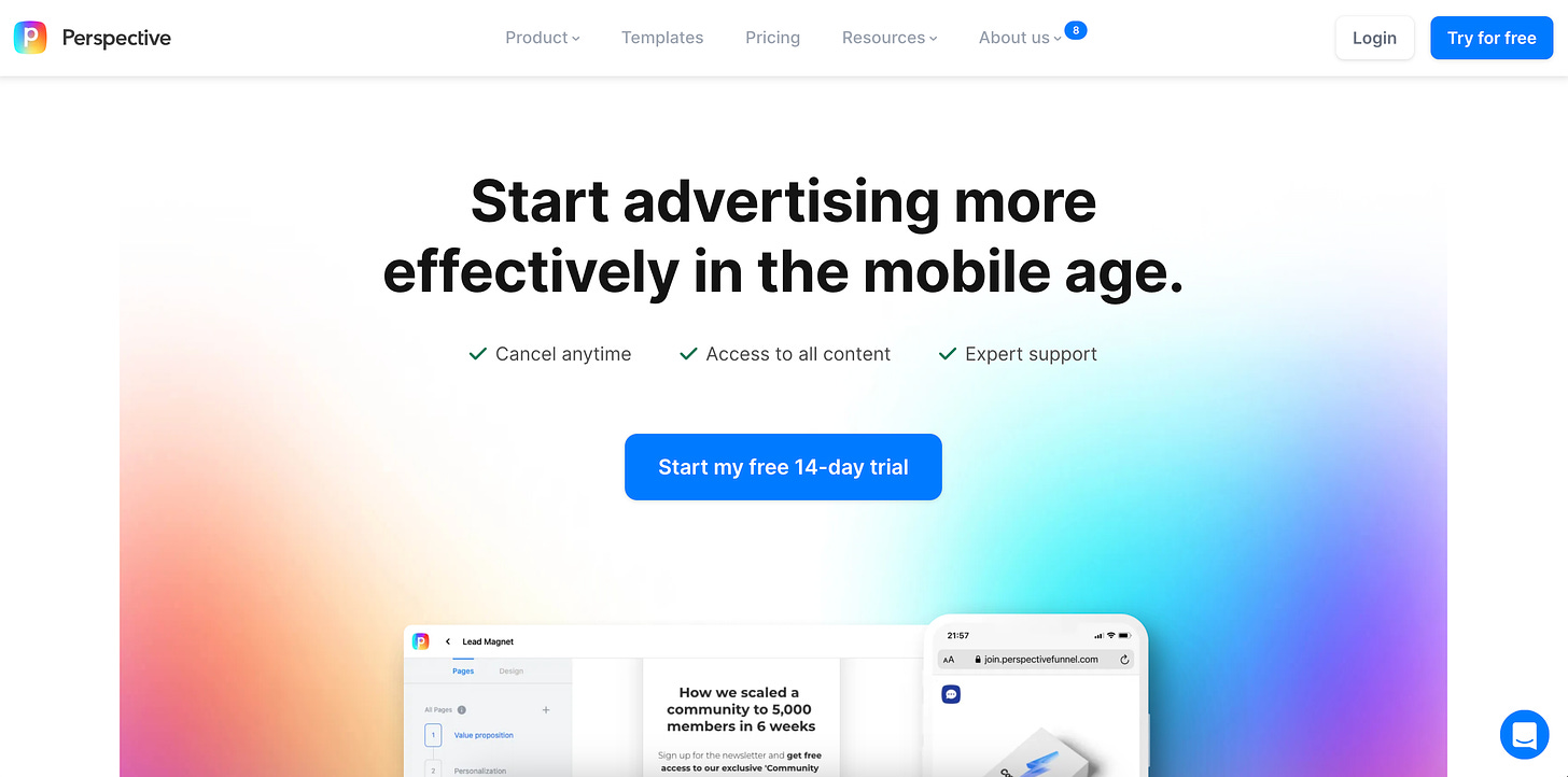
1. The (Sticky) Navigation Bar Section
Include your logo, main navigation items (section links for a landing page), and Main CTA
Consider making it sticky to have the Main CTA always visible in the viewport
Example (Perspective):
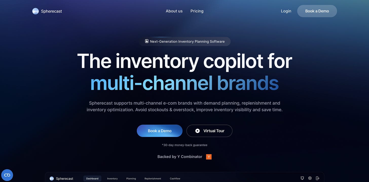
2. The Hero Section (Above the Fold)
This is the most important section of your website. It should grab attention and answer core questions about your product.
Elements to include:
Headline (H1)
Subheadline or description
Primary and secondary CTAs
Product image/animation/video
Objection-handlers and Trust Elements
Example (Spherecast):
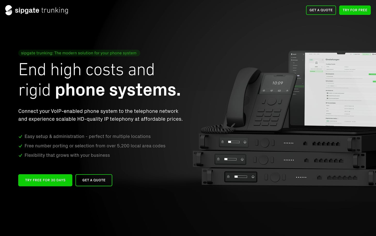
Example (sipgate trunking):
This example has no navigation since it’s a pure landing page
3. The Social Proof 1 Section
Build trust immediately after the hero section.
Showcase customer logos, ideally of known companies
Add a tagline highlighting your ICP company type (optional)
Consider using testimonials, case studies, or third-party reviews
Example (fyno):
Example (clay):
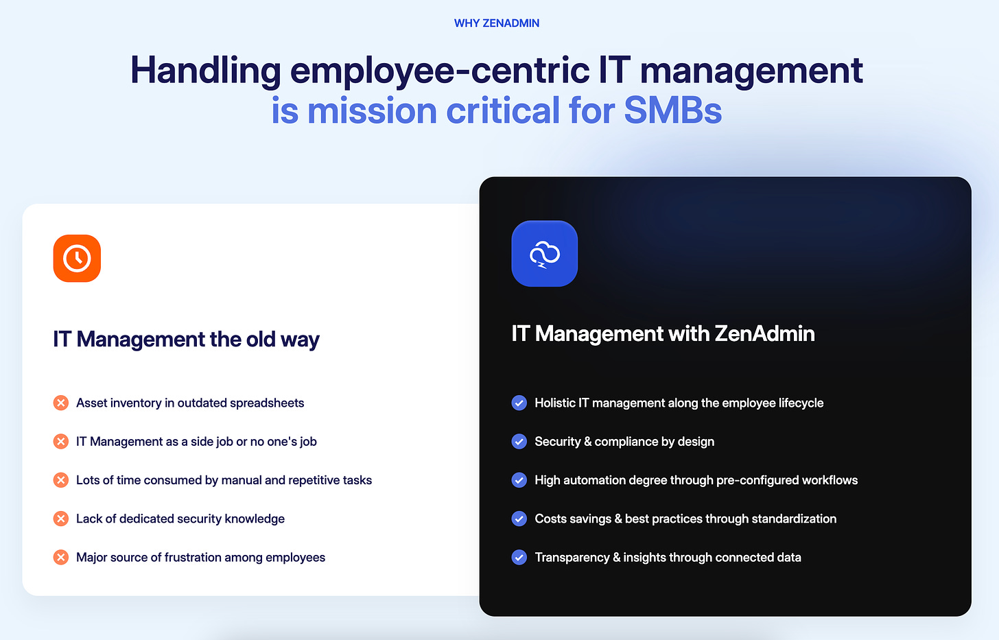
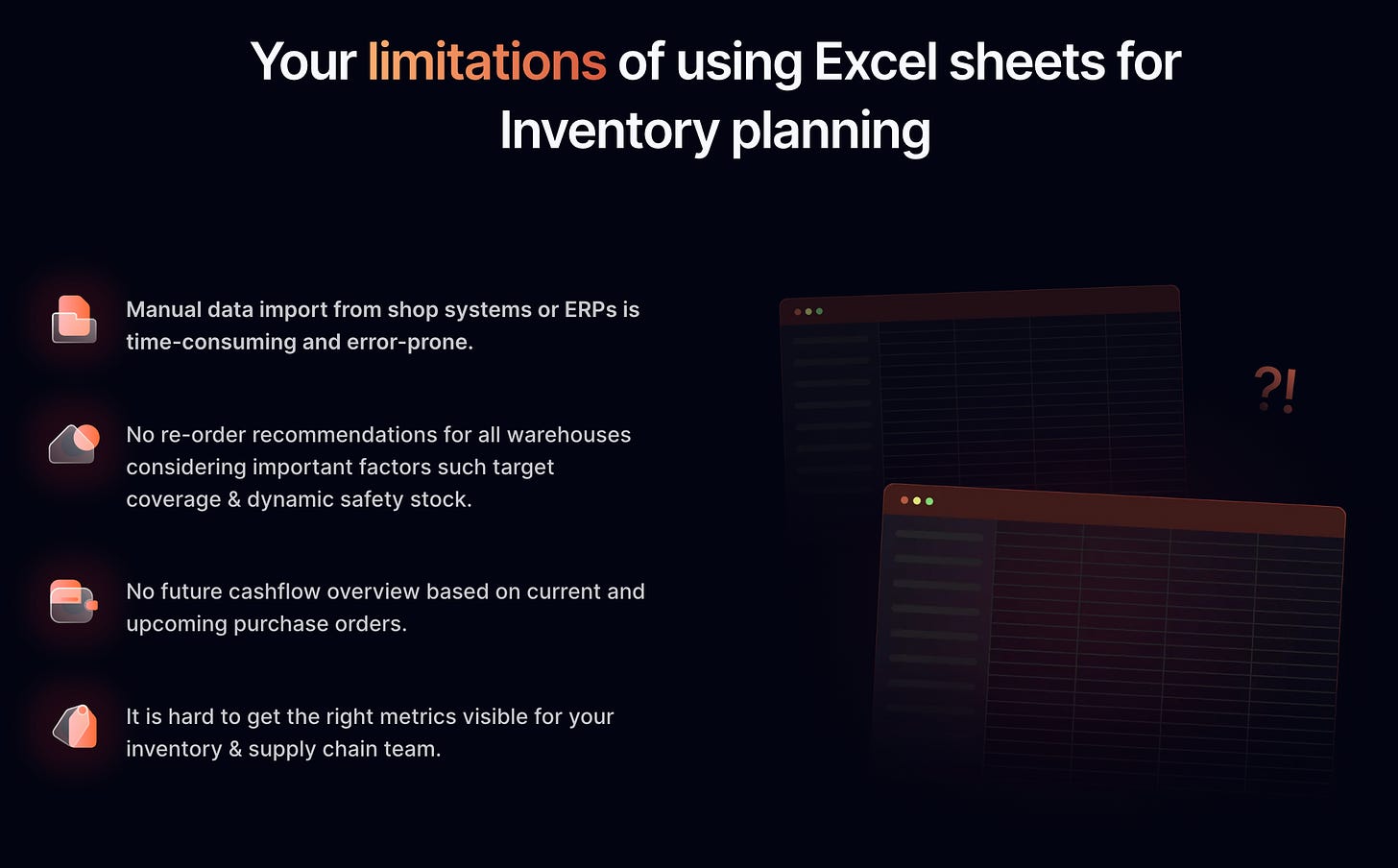
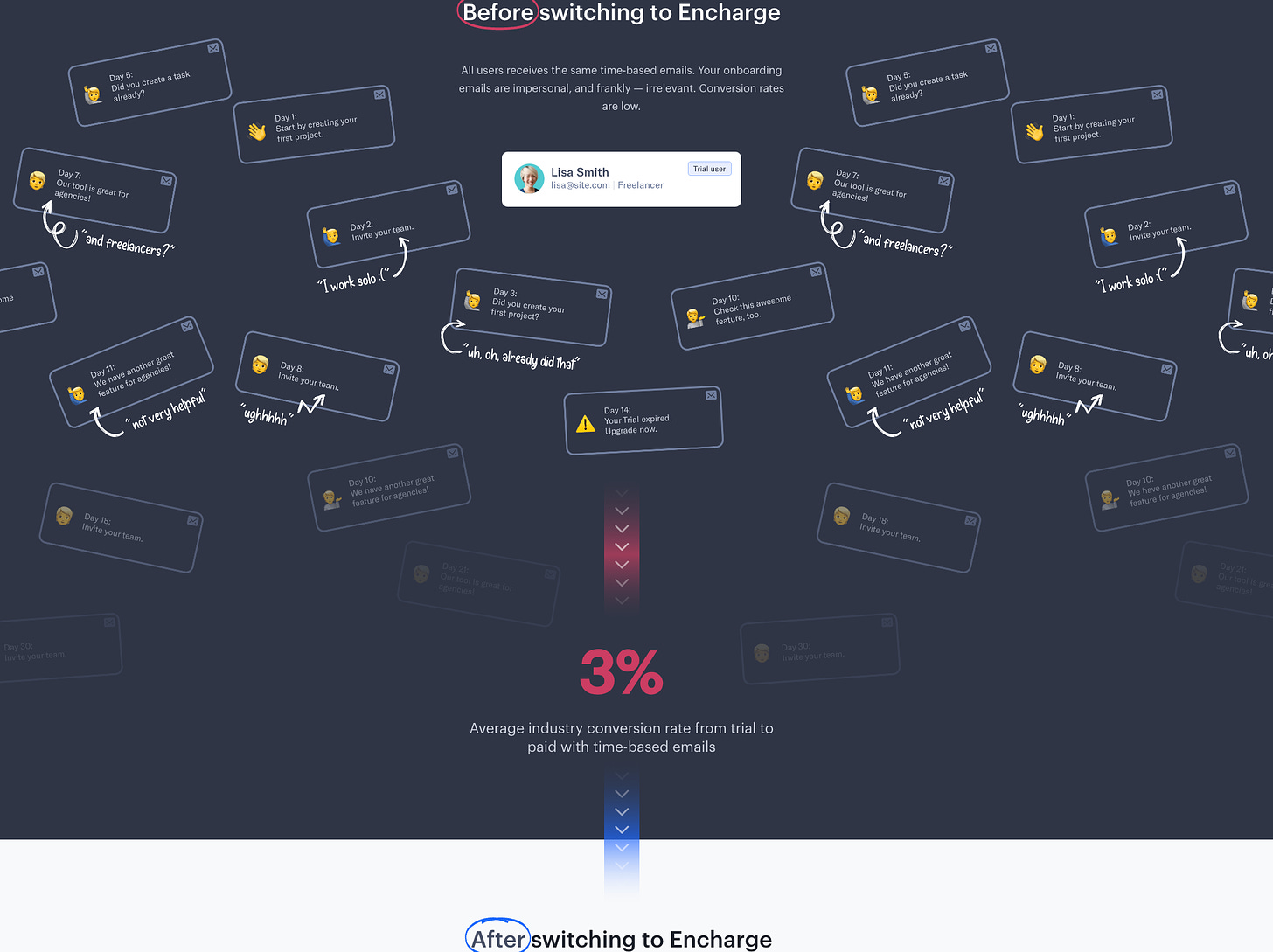
4. The Problem Section
Connect with visitors by acknowledging their pain points.
Use elements from your Messaging Framework: Problem, Primary current solution (Status Quo), Competitive alternatives & limitations
I recommend using this section when your customer is not that aware yet, so some companies we work with tend to keep this optional or use this section in a modified way, e.g. with a comparison table (Old world (Status Quo) vs. New world (with your solution))
Example (ZenAdmin):
Example (Spherecast):
Example (Encharge):
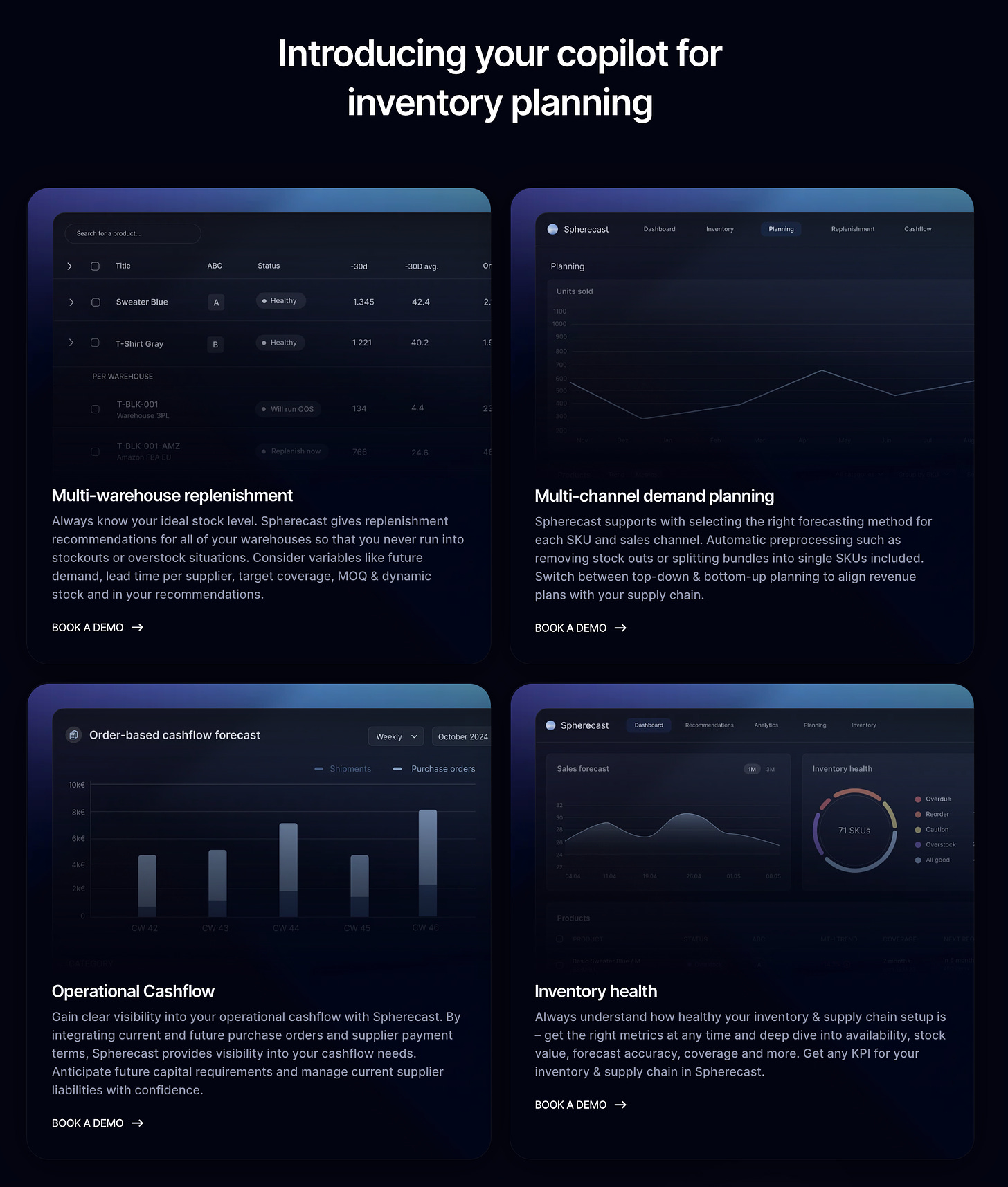
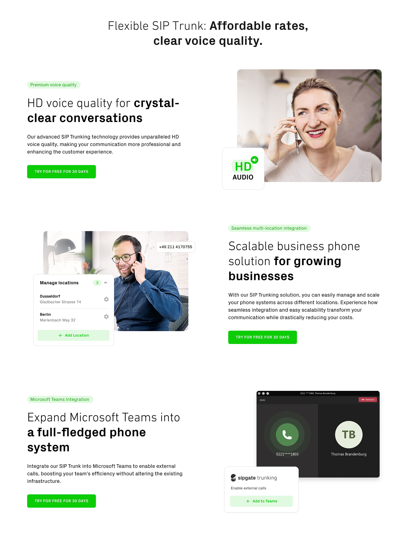
6. The Solution Intro + Value Propositions Section
Bridge the gap between the problem and your detailed solution.
Present your core value propositions, showing how you solve the customer's problems.
Communicate the main 3 capabilities
Highlight top features
Explain main benefits
Show corresponding product features visually
Example (Spherecast):
Example (sipgate trunking):
This value proposition section addresses the key elements:
It leads with the capability
It emphasizes the problem
It highlights the key feature
It clearly states the main benefit
It explains what you can do with it
It shows the transformation from the current way to the new solution
6. The Special Purpose Sections (Optional)
Address specific needs or objections of your visitors. Options include:
Feature overview
How it works
Blog section
Templates
Use case pages
Segmentation pages
Pricing
Highlighting relevant info for ICP (e.g., GDPR compliance, integrations, security)
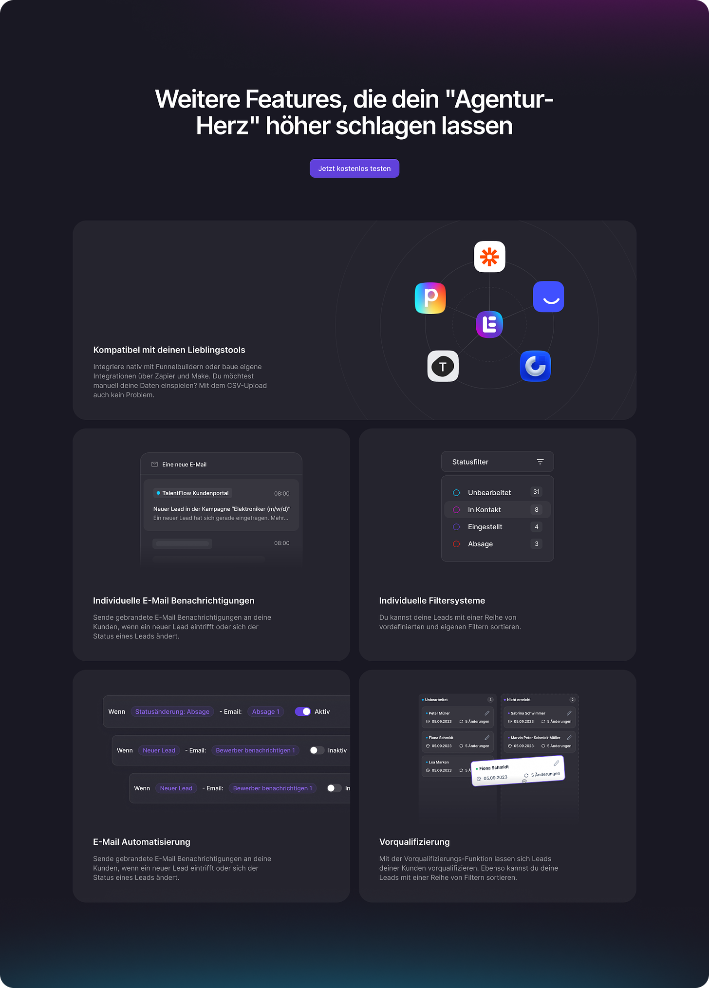
Feature Wall Example (LeadTable):
Feature Wall Example (Dealforward):
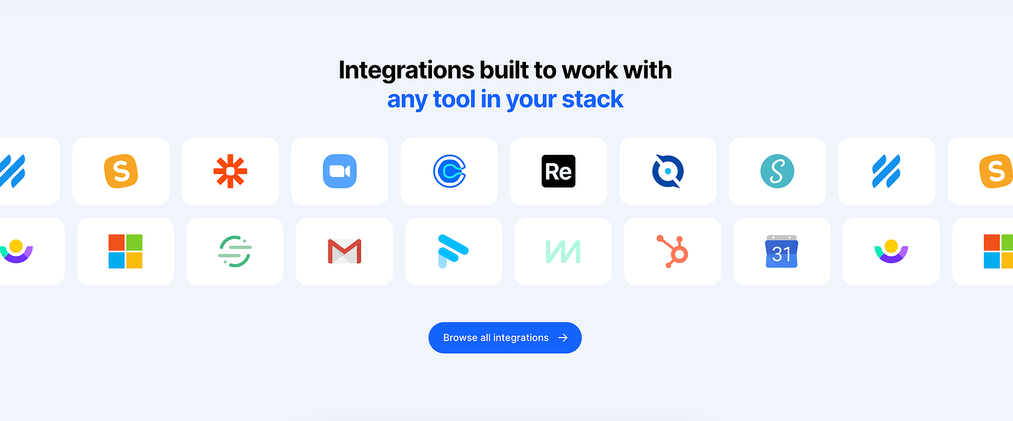
Integrations Section Example (Close CRM and Clay):
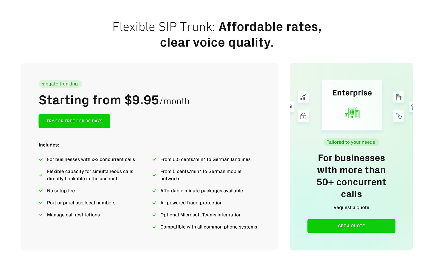
Pricing Section Example (sipgate trunking):
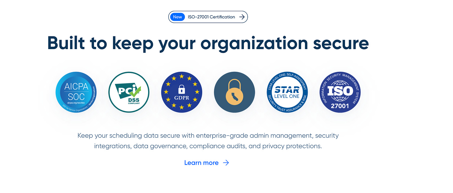
Security Section Example (Calendly):
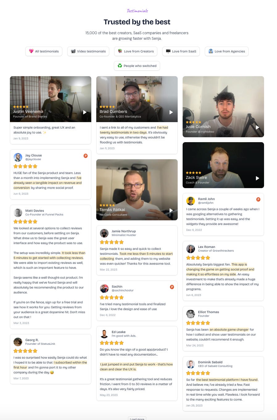
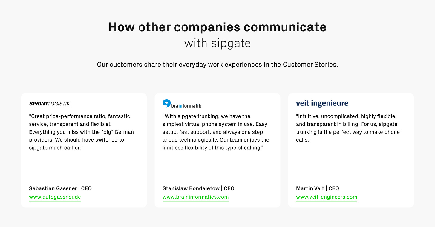
7. The Social Proof 2 Section
Reinforce trust near the bottom of your page.
Promote case studies
Embed customer testimonials/quotes
Include third-party reviews/badges
Example (Senja):
Example (sipgate trunking):
Example (Coana.tech)
8. The FAQ Section
Handle potential questions related to objections.
Example (clay):
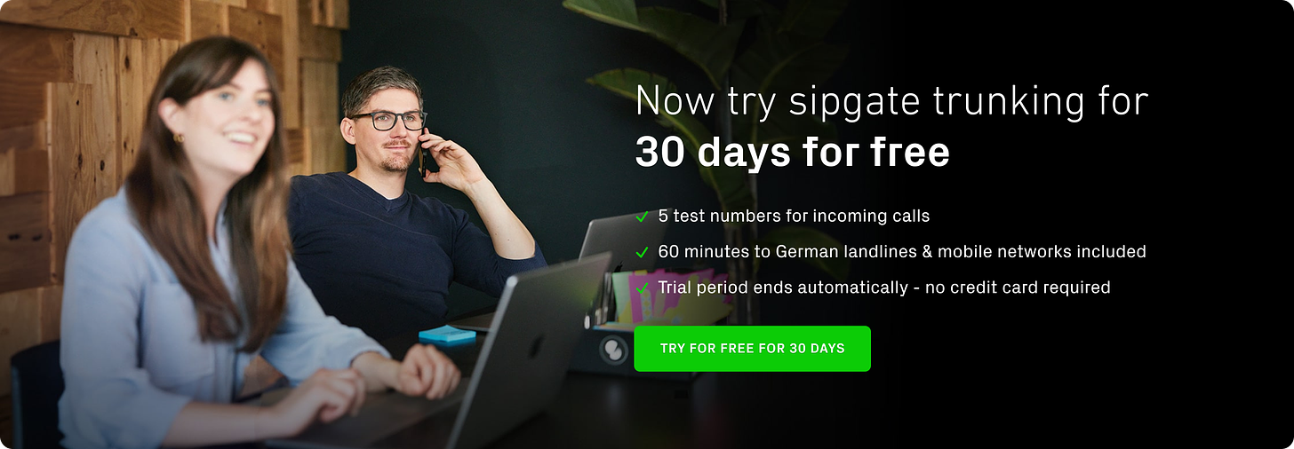
9. The Main CTA Section
Make your final pitch and guide visitors to take action.
Focus on your primary CTA
Restate your value proposition briefly
Example (sipgate trunking):
Example (Livestorm)
10. Footer
No rocket science here. You can include an alternative CTA depending on your target audience and provide some legal information.
Example (sipgate trunking):
Step 7: Design Implementation
Bring your strategy to life with a design that enhances your message, and doesn't distract from it.
Key design principles include:
Use whitespace effectively to guide the eye
Ensure your design is mobile-responsive
Use contrasting colors for your CTA buttons
Incorporate high-quality, relevant images or animations
Maintain consistency with your brand guidelines
Step 8: Testing and Optimization
Continuously gather data, test variations, and refine your approach based on user behavior. Here's how:
Set up heat mapping and scroll depth tracking
Implement A/B testing for key elements (headlines, CTAs, images)
Monitor your core metrics (bounce rate, time on page, conversion rate)
Gather qualitative feedback through user testing and surveys
Iterate based on your findings, focusing on the elements that move the needle most
General Tips for Your SaaS Homepage
Include a CTA/button in almost every section
Use powerful, concise CTAs (max 3 words) like "Get started", "Free trial", "Book a demo"
Focus on headlines - 80% of visitors only read these
Aim for 6-word headlines over max 2 lines
Use color contrast for easy reading
Use a conversational tone and your ICP's language
Address the visitor directly (speak to one person)
Keep copy short and easy to understand
Why this unique philosophy works…
The reason is simple: Your homepage isn't about you. It's about THEM.
Your ideal customer. Their problems. Their desires. Their language.
Most B2B SaaS companies get this dead wrong. They start with features, with their "revolutionary technology," with what THEY think is important.
Focusing on the customer first creates a message that resonates deeply, making your solution feel like the obvious choice. Combining this with a crystal-clear design will skyrocket your conversions.
The top 5 mistakes when it comes to SaaS homepages ❌
Most B2B SaaS companies start with their product features. Big mistake. Your customers don't care about your features. They care about their problems.
Generic "best practices" are BS. What works for one company might tank conversions for another. You need a tailored approach based on your unique customers and value proposition.
Clarity trumps cleverness every damn time. Your homepage isn't the place to show off your witty wordplay. It's the place to communicate your value so clearly that a drunk monkey could understand it.
Design without strategy is just pretty garbage. Sure, your site might win some design awards, but if it's not converting, who cares?
Most companies give up too soon. They try one or two things, don't see immediate results, and throw in the towel. This is a process. It takes time, testing, and refinement.
🎉 Special: SaaS Homepage & Messaging Service
The good news? You don't have to do this alone.
We, Tarik and Alex, have a special offer for you. We combine our strengths and offer a unique service just for you.
SaaS Homepage & Messaging Service Special 🎉
What you get (deliverables):
✅ Your SaaS Messaging Framework (4x 90min co-creation sessions)
✅ Wireframes of your 4 key website pages (Figma file):
your new homepage with design + copy
book a demo page (sales-led) with design + copy
signup page (product-led) with design + copy
pricing page with design + copy
Your Investment: 7.500€ (instead of 12.500€)
✅Optional: Development of all pages in webflow (+2.500€)
Interested?
Fill out the form and apply for the special offer. After you submit the form, we will reach out to you and book a free intro call with you.
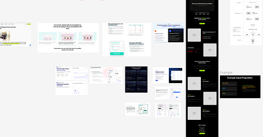
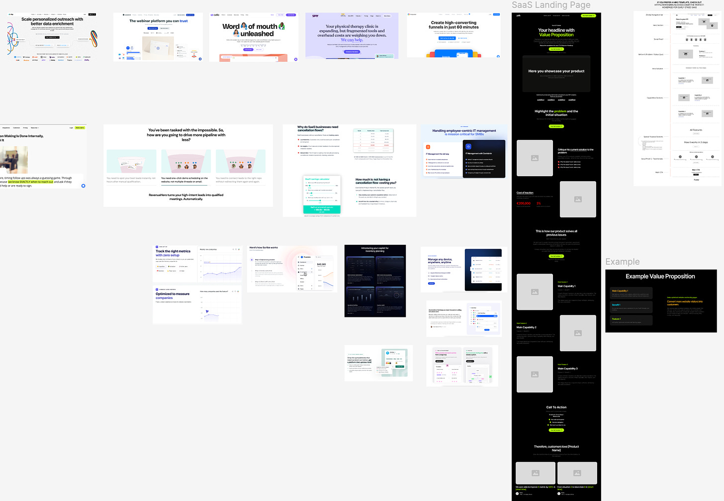
Bonus: Figma File (SaaS Homepage) 🎁
To make it easier for you to get started, we’ve created a Figma file (for free).
The B2B SaaS Performance Design Homepage Framework (Figma Template + Examples) is available in DE & EN.
The Figma templates follow the principles we’ve described in this article.
Happy growth 🚀
3 ways I can help you grow your SaaS to €1 million ARR 🚀
Build your GTM strategy with my free SaaS GTM Strategy Workbook (helped 4500+ SaaS leaders)
Get access to 100+ actionable SaaS growth tactics (helped 250+ SaaS leaders) - 100% positive ROI guarantee.
Work 1-on-1 with me - GTM Advisory for early-stage SaaS founders on their way to €1 million ARR (1 free spot - limited to 8 founders).


