The Perfect Homepage for Early-stage SaaS companies: Free Template + Examples + Tips
Hey - it’s Alex!
Welcome to Startup Business Tips, a bi-weekly newsletter, where I share with you 3 actionable growth tactics that will help you quickly grow your SaaS business from €0 to €1 million ARR 🚀.
Today we cover:
1️⃣ Why your SaaS homepage is important and what you need to create a good one.
2️⃣ The 7 (+2) sections of the perfect SaaS homepage (incl. free template)
3️⃣ Great SaaS homepages to check out & general tips
👉 Bonus tip by Maja Voje (Founder & Investor of Growth Lab)
👉 Bonus material (software, content, news) - this time the Risk of Freemium
🚨 P.S. This newsletter might be too long for your inbox. Read the full version here.
A quick word from our sponsor: raaft.io
📢 Reduce your churn rates by 20% with smart cancellation flows
Losing customers that took so much effort to acquire? Raaft helps SaaS companies save churning customers with 3 tactics:
Know which users are likely to cancel soon
Retain users on auto-pilot at the moment of cancellation with targeted offers depending on their churn reason
Get great churn analytics so you can know how to improve your product.
Want to reach 4500+ early-stage SaaS founders/leaders? Sponsor the next newsletter.
1. SaaS Homepage - Why it is important and what you need to create a good one.
Your homepage is the number one customer-facing messaging asset. Almost all your potential clients will visit your website and decide if they continue the ‘buyer journey’ (aka. Free Trial or Book a demo) or stop.
Keep in mind that your homepage should primarily speak to your potential customers (aka. your ICP - ideal customer profile) - and not to your employees, investors, media, or any other stakeholders.
The goal of your homepage is to convert your visitors to the next stage of your sales journey (mostly free trial or book a demo). This being said, your homepage and messaging should focus on this primary objective.
What this also means is to focus on the important key elements - and not to cover all your features, benefits, and in-detail questions your customers could face along the way.
Your website should provide answers to the 6 key questions of your visitors:
What is the product/service they offer?
What problem does it solve for me?
What can I do with the product?
Who is it for? Is this product for me?
What are the main benefits for me?
Can I trust the company?
To get this right, you need to have:
Solid understanding of your ideal customers
A first version of your SaaS messaging
Bonus:
As a tool, I would highly recommend using Webflow.
SaaS website site structure: Check out this awesome blog post
P.S. If you are pre-revenue and don’t have enough data about your ICP and messaging, try to talk to at least 20+ potential customers and based on that draft your version 1 of the ICP and messaging. Once you gather more info (customer support, sales demos, trial data, etc.) you need to adapt both.
2. The 7 (+2) sections of the perfect SaaS homepage (incl. template)
Now let’s have a look into the different sections for a powerful SaaS website. We will go from top to bottom and cover each section.
or simply use our SaaS Homepage Figma Template.
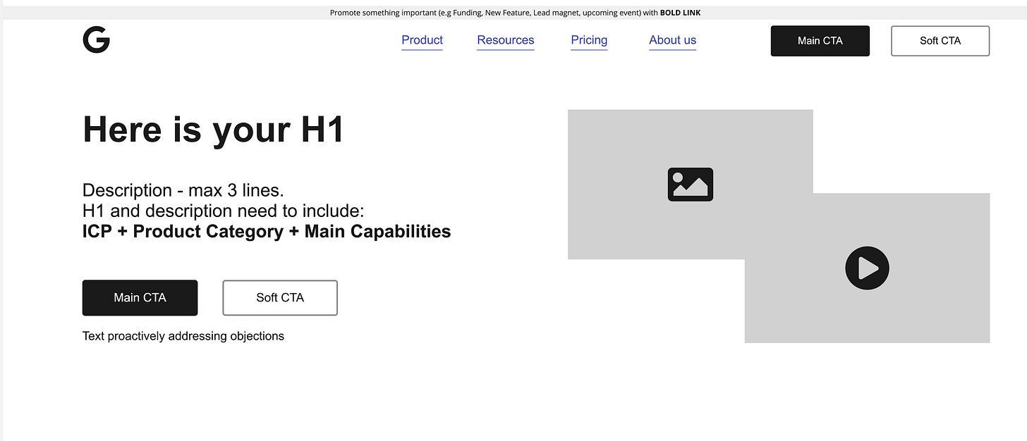
1. The (Sticky) Navigation Bar Section
The navigation bar consists of:
your logo (top left)
the ‘actual’ navigation with the product, pricing, resources, and about us pages
your call to action(s) - primary and softer secondary CTA
On top of the navigation bar, you can embed a floating element to promote things that you want to highlight right now, like your latest funding round, an upcoming webinar, or new feature announcements.
Keep in mind that with the suggested site structure (navigation bar) you can easily add more pages as you’re growing and have more resources to build more specific pages (e.g. pages for each feature, use cases, newsletter, integrations, etc.)
2. The Hero Section (Above the Fold)
The hero section is the most important section of your website.
Most visitors only stay on the top part of your page and only start to scroll down and skim through your page, if your above-the-fold section is powerful and grabs their attention.
If not, you will see very low conversion rates and high bounce rates.
Both design and copy need to be on point. Nice design, but a bad copy, doesn’t show any significant results.
The goal of this section is to grab the attention so that the visitor stays on your page and continues to read.
The section needs to answer the core questions:
What is your product (aka. product category) and what can I do with the product (aka. capabilities)
What’s the value of the product (aka. benefits)
Is this product for me? (aka. ICP)
What does it look like? (aka. product image/animation/video)
Bonus:
proactively address most common objections (e.g. no credit card required; set-up in under 10 minutes, 100% GDPR compliant)
creating trust (e.g. Capterra badges, G2 reviews, etc.)
To answer these questions, you have the following elements of the hero section:
Your Headline (H1)
The text below your H1 (e.g. H2 or description)
the text box below your CTA buttons
image/video to tease your product
So to get the copy write in this section, make use of (open your Ultimate SaaS messaging framework):
Product category
Problem & desired outcome/dream state
ICP (persona & company type)
Capabilities
Top Features
Main Benefits
Top objections
In terms of call-to-actions (CTA) I would recommend going for one primary CTA (free trial for PLG companies & book a demo for sales-led companies) and a softer secondary CTA (e.g. Join a Webinar, Download Lead Magnet, Watch product demo, etc.)
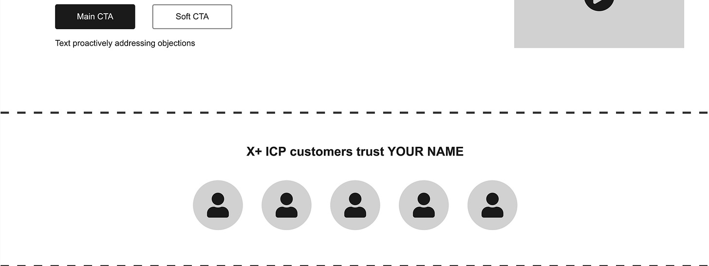
3. The Social Proof 1 Section
After the hero section, it’s time to create trust. It’s called social proof.
The most common way is to showcase some of your customers (logos).
On top add a small tagline where you highlight again your ICP. This could sound like the following:
100+ leading tech startups trust XYZ
Trusted by 5000+ freelancers worldwide
10k+ salespeople close deals faster with XYZ
But you can also use testimonials, case studies, third-party reviews (e.g. Capterra, G2, Trustpilot, etc.), or press/ media coverage (e.g. featured in X).
Depending on your design of the page, this section can even be visible already in the ‘above the fold’.
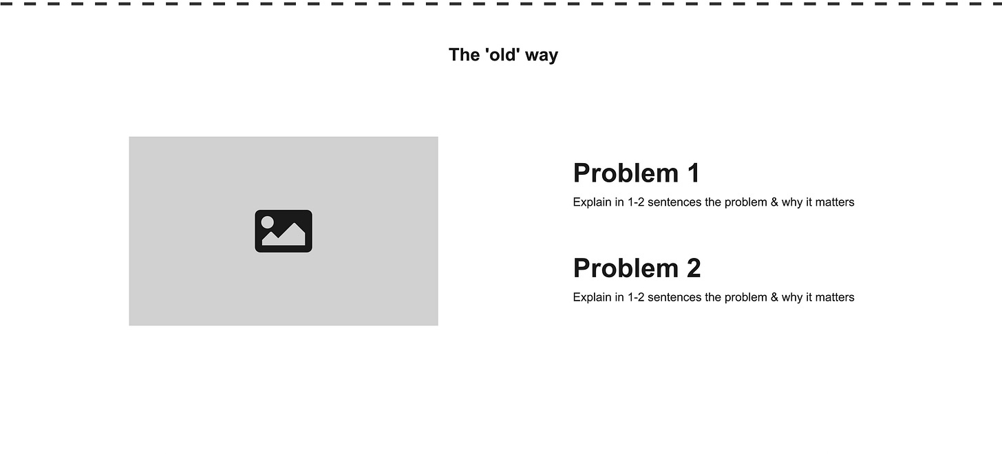
4. The Problem (Before X) Section
The problem section is something that most SaaS companies forget about - I believe this is a big mistake.
With this section, you set the context. You connect with the visitor and present them with the ‘shitty’ status quo they are in right now - before you introduce your product as the right solution.
This section mainly has 2 reasons for existing:
Tell the visitors about their ‘shitty’ status quo, so they know they have a problem (that’s worth fixing).
(dis)qualify visitors: if they do not resonate with this section, there’s a high chance that your product is NOT relevant to them.
If you ignore this section, you assume that your customers know about their shitty status quo. And I doubt that everyone knows it.
If you use the SaaS Messaging Framework the following elements are your friend:
Problem
Primary current solution (Status Quo)
Competitive alternatives & limitations
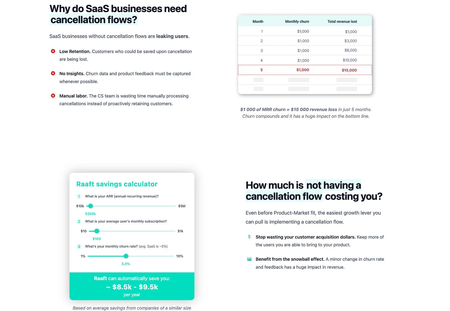
Here are some great inspirations for problem (before X) sections:
5. The Intro of your Solution Section
Now after your visitors are aware of the problem (of their current solution), it’s time to introduce the hero (aka. your product). It’s the better/new way (compared to the shitty current solution).
Most of the time, this is just a super small section that consists of 1-2 sentences. Ideally combine your product category, the main benefit it brings to your ICP, and/or the main capability of your product.
It’s the headline for the upcoming capabilities section where you go into more detail about what the product enables the user to do (which they can’t do without using your tool).
6. The Capabilities Section
Now once the visitors understand the problem you are going to solve for them (problem section) + how you solve it (intro solution section), you can finally present your product.
But keep in mind that it’s not a product tour, help center article, or set-up instruction. It’s not about showing all your features in detail.
The best is to communicate:
The main 3 capabilities (what users can do with your product, they can’t do without)
The top features (that power the capabilities)
The main benefits your users get from this
Show the corresponding feature in your product (image, gif, animation, etc.)
Here are some great inspirations for capabilities sections:
7. The Special Purpose Sections
Now after the capability sections, you can add 1 or 2 sections to address specific needs or objections of your visitors.
There are different options for how you can use these 'special purpose' sections:
Show all features (e.g. Wall, Feature Tabs)
How it works
Case Studies
Blog Section
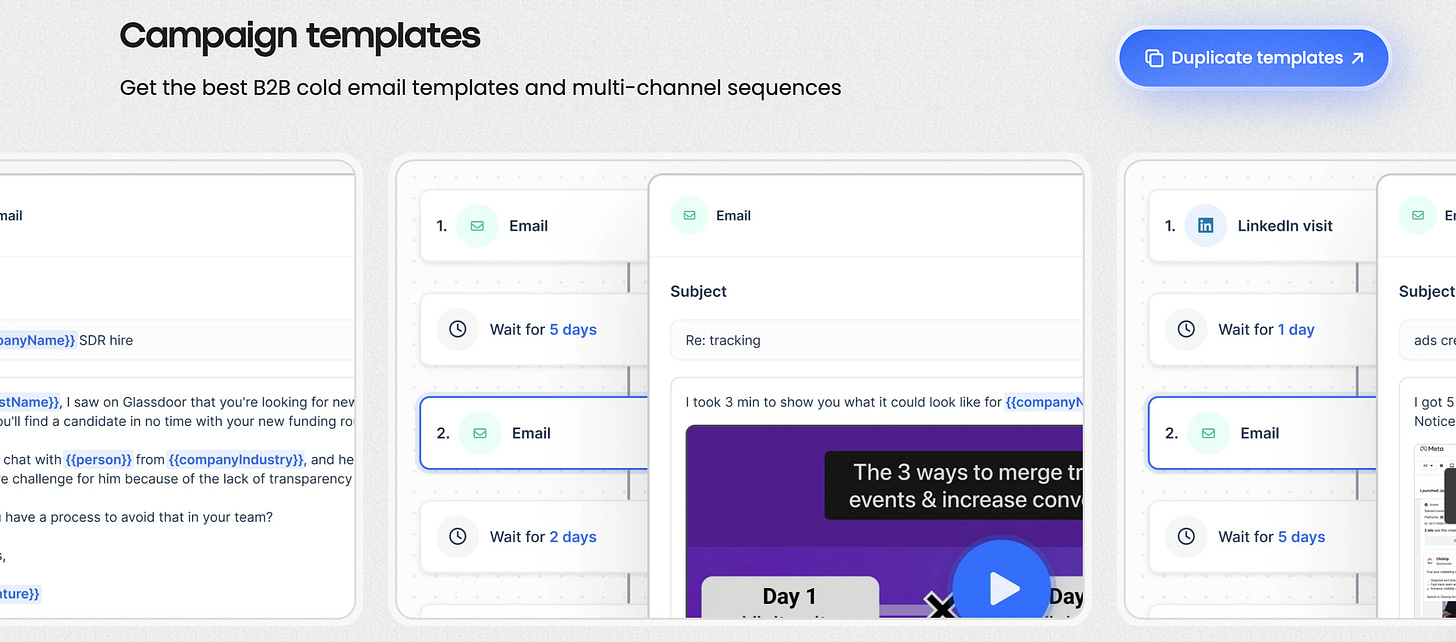
Templates
Intro of different Usecase Pages
Intro of different Segmentation Pages (different persona / Company Type pages)
Highlighting relevant infos for ICP (e.g objections, GDPR, Integrations, Security)
Here are some great inspirations for these special purpose sections:
Feature wall by Scribe
Security section by Calendly
Usecase section by Livestorm
Template sections by Phantombuster and Lemlist
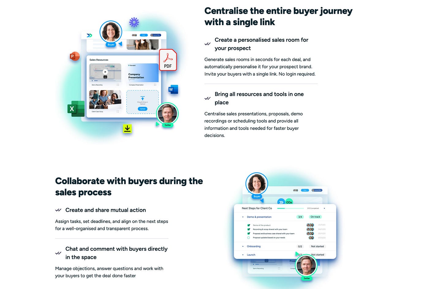
Integrations by Dealforward
So you see you have many options.
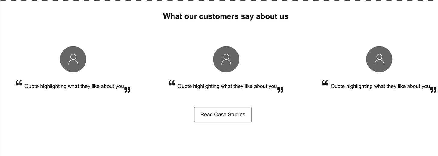
8. The Social Proof 2 Section
The bottom of your page should be a second social proof element and a final CTA section.
For social proof, you can promote your case studies and embed customer testimonials/quotes or third-party reviews/badges from sites like G2, Capterra, OMR reviews, etc.
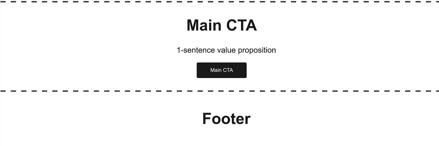
9. The Main CTA Section
Don’t forget to add a final CTA at the end of your page. Focus on your primary CTA and re-state your value proposition in 1-2 short sentences.
This section is the last one before the footer of your page.
Here are some great inspirations for main CTA section:
Livestorm
Dealforward
June
Keep in mind that there is not just ‘one way’ to do it - obviously, you can tweak your version based on this template. But it gives you a very solid baseline to get your SaaS website to perform.
👉 Before you read on:
✅ Create your own powerful SaaS GTM Strategy with my FREE Workbook (helped 3000+ SaaS professionals) and GTM-strategy 1-pager Notion template (helped 1000+ SaaS professionals)
✅ Unlock your growth potential with 90+ actionable SaaS growth tactics (helped 150+ SaaS professionals)
✅ GTM Advisory for early-stage SaaS founders on their way to hitting the first €1 million ARR. We’ll have regular 1-on-1 sessions deep-diving into your most important challenges.
❤️ Get exclusive benefits for sharing my newsletter with your SaaS network.
3. Some general tips for your website + great SaaS homepages to check out
Now you know the structure of the perfect homepage.
Here are some more general tips for building your perfect homepage:
Have a CTA/button (in almost) every section
Use powerful maximum 3 words CTA (like Get started, Free trial, Book a demo, Sign-up free, 14-day free trial, Request access, Join waitlist)
Headline matters: 80% of the visitors only read the headlines
aim for 6 words headlines over max. 2 lines
the contrast of colors to make it easy to read
Conversational tone + language of your ICP
Talk directly to the visitor (speak to one person)
Keep the copy short and easy to understand
Check out these amazing SaaS websites for more inspirations on great sections or full pages:
If you want to dive deeper into SaaS website, have a look at these amazing resources too:
💡Best tip, failure, and learning by Maja Voje (Founder & Investor of Growth Lab)
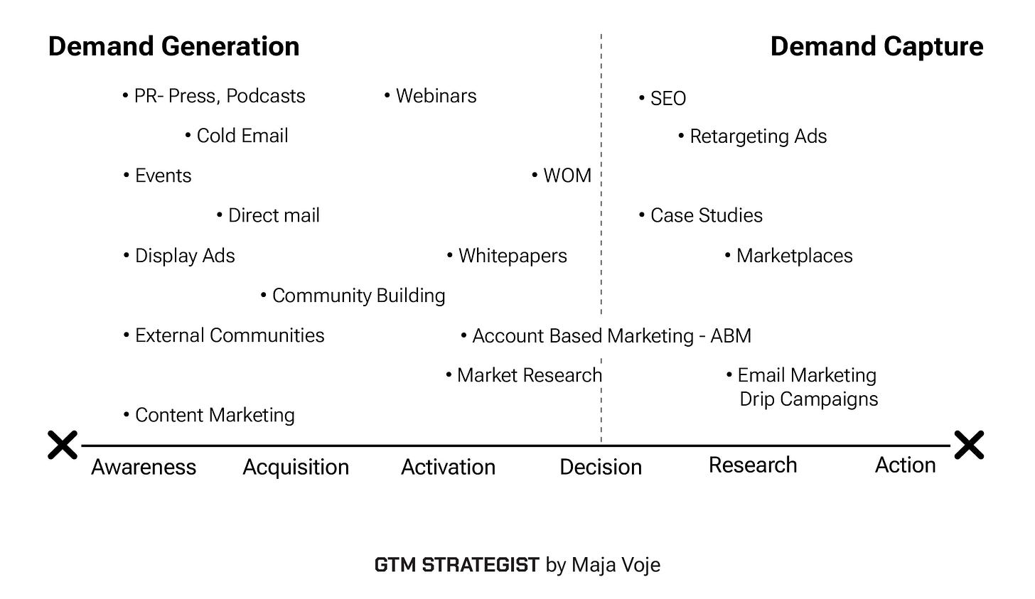
With GTM, you have 3 to 18 months to win sufficient demand from your Beachhead Segment - your minimum viable market segment.
When there is existing demand, always try to focus on demand capture first. Similarly, you can initially capture demand from adjacent categories when you're selling a solution that is novel and requires education. For both of these activities, make sure you're prioritizing activities and channels that require lower investments, give you a quick feedback loop, and have shorter sales cycles. Definitely stay away from SEO until you have product-market fit.
Since only 5% of your market is in the buying mode at any given time, you can quickly saturate your demand capture and then it's time to start working on a long-term, more sustainable mechanism of demand generation. Think of organic & paid social, community and brand building, virtual and in-person events.
P.S. Don’t miss it. Maja will launch her own handbook on GTM.
🧠 Do you want to be next and share your best tip with 2000+ SaaS professionals? Reach out to me via Linkedin.
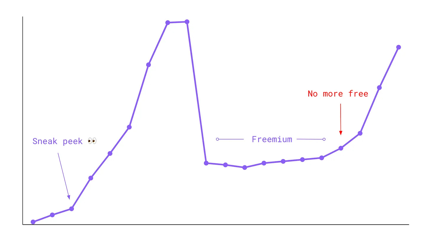
💪 Bonus material (software, content, news) - this time the Risk of Freemium Pricing
Deciding on the right pricing strategy is a key success factor for the growth of your SaaS.
How Equals introduced the freemium, what happened, and how they fixed the problem.
Happy growth 🚀.
3 ways I can help you grow your SaaS to €1 million ARR 🚀
Build your GTM strategy with my free SaaS GTM Strategy Workbook (helped 4500+ SaaS leaders)
Get access to 100+ actionable SaaS growth tactics (helped 250+ SaaS leaders) - 100% positive ROI guarantee.
Work 1-on-1 with me - GTM Advisory for early-stage SaaS founders on their way to €1 million ARR (1 free spot - limited to 8 founders).
For daily actionable tips to grow your B2B SaaS business, follow me on Linkedin.











Wow, that is an exceptionally well-researched and applicable piece of content. Proud to be included! Thanks again, Alexander, for your valuable advice and support to GTM Strategist. Means a lot to us. See you at the launch of https://gtmstrategist.com/ and GTM Strategist Podcast soon!